Are you struggling to convert your website visitors into loyal customers? Consider optimising your landing pages for users to give your pages a better chance of performing better.
Whether you’re creating a new landing page to aid in your paid advertising campaigns or you’re optimising an existing page, following landing page optimisation strategies is an easy way to ensure they perform as expected. Let’s take a look at what a good landing page looks like and the endless benefits it can have on your business.
Landing pages can sometimes be the first interaction that a user has with your business, so it’s important to ensure that they’re consistent with how the rest of your site looks, provides value and serves a purpose.
After all, people aren’t going to click on your page and convert if your landing pages don’t give them what they expect to see.
To increase the chances of your landing page performing as expected, ensure that they include the following key elements.
With your customer persona in mind, think about what you want the landing page to achieve. Landing pages should be designed with a solution to a potential issue or pain point that a user might have.
For example, you could create a landing page that covers the benefits and uses of a key product or product range that you want to sell. You could then create a paid advertising campaign that links to your landing page.
Remember: You should always consider where your customers are in their buyer journey. If they’re at the top of the funnel, they’ll expect a landing page filled with information. If they’re close to making a purchase, you’ll benefit from using persuasive CTAs and verbiage.
Headings are one of the first elements that people see on your landing page. It’s the first impression the user gets when coming across your page, so if it doesn’t capture their attention, they likely won’t click on your page or continue reading.
Much like our previous point, it’s all about creating headings that cater to what your audience wants to see. It’s all about understanding what your target audienceis looking for and how the page can address specific pain points.
By using value propositions and wording headings in a way that instills emotions or a sense of urgency, you’re more likely to catch their eye.
CTAs are extremely important for any marketing channel. Whether they’re discreetly used within the text like ‘Browse our range for more information’ or you use a CTA button, they’re essential for encouraging users to take an action.
When creating a CTA, they should be direct, easy to understand and stand out. This can be done by using colours that pop out, bigger text sizes or putting it somewhere that is hard to miss.
At Proof3, our CRO team are on hand to optimise your website conversions. Get in touch with our team if you’d like us to take a look at your CTA design and placement to get the most out of your landing pages.
Hero shots are the large, eye-catching image at the top of the page that grabs your attention straight away. Much like the headings, they’re used to spark the interest of the users.
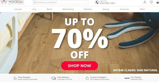
Take the example of one of our clients, Wood2U. Their hero shot on their homepage clearly shows that they sell wood-effect flooring, they have a huge sale on and it clearly contains a CTA to guide users to take an action. This not only adds to the aesthetic of the site, but it is also functional and serves a purpose – to attract users to see what they have to offer.

For many years, ensuring that your site is optimised for mobile has always been a priority. However, now that Google only crawls websites on mobile, you’ll be limiting your chances of being indexed on Google if your site isn’t mobile optimised.
For many businesses, Google’s mobile-only indexation wouldn’t have affected your site. Google has been in the process of rolling out its mobile indexation for many years, so most sites would have switched to mobile indexing years ago. But if you’ve seen a sudden drop in performance, not optimising your landing page for mobile could be an impacting factor. To ensure that your landing pages are as mobile-optimised as possible, consider these tips:
Ensure your landing pages adjust to the size of the device being used.
Optimise your page speed (more on this in the next section).
Ensure that users can still navigate the page on different devices.
Minimise the use of popups.
Use mobile-friendly fonts like Baskerville, Adobe Garamond or Roboto.
With hundreds and sometimes thousands of alternative options when it comes to finding things online, ensuring that your landing pages load promptly is important to ensure users don’t leave your site before the content can load. In fact, 53% of users leave a site that takes longer than 3 seconds to load. That’s a lot of missed conversions.

If you want to provide your users with a better online experience to increase the chances of them staying on your site, consider these best practices:
Make sure the server gets back fast when asked for data.
Ensure you use caching, so browsers remember parts of your site and don’t take as long to load.
Make sure pictures are internet-friendly in size without losing quality.
The key to any successful landing page, and marketing strategy in general, is to test what works and what doesn’t. At Proof3, our CRO team can run various A/B testing on various elements of your landing page based on real data to optimise its performance.
Using variations of elements like colours, CTA placements, content, links used and more, we can see which variation is the most effective at converting and drawing the user’s attention.
Now that we’ve explained what makes an effective landing page, you might be wondering what the benefits of an optimised landing page are. Let’s take a look at some of the key reasons that make landing page optimisation so beneficial for your business:
Makes a positive first impression: For new users, their first interaction with your website could be coming across a paid ad linking to one of your key landing pages. If your page gives a good first impression, chances are they’ll be more likely to stay on your site.
Boosts conversion rates: A well-optimised landing page can significantly increase your conversion rates. By testing the placement of CTAs with A/B testing, you can increase the chances of users completing a desired action.
Enhances user experience: A landing page that loads fast and is easy to use and navigate ensures that users can easily consume the content, giving them a better online experience. This also reduces the chances of users being dissatisfied and clicking off the page.
Improved visibility and organic reach: Optimising your landing pages not only benefits users, but search engines will favour content that is valuable and created for users. By optimising your landing pages for users, search engines are more likely to show your content above your competitors.
Ultimately, a well-designed page that is fast, looks good and gives users what they’re looking for straight away can only be beneficial for businesses. No matter how big or small your website is, providing users with relevant content on your landing pages provides an endless list of benefits.

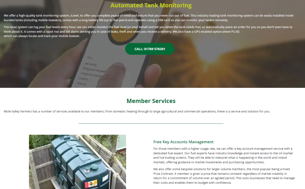
Our client, Mole Online, created a landing page to inform visitors about the various fuel options that they have available for farm, home and business applications. By including various CTAs, imagery, providing value to users by including headings like ‘Our Fuel Team Are Here For You’ and providing users with information on various fuel options, the landing page was able to give users exactly what they expected to see. This has resulted in this page in particular having a significantly high click-through rate compared to other pages on the site.

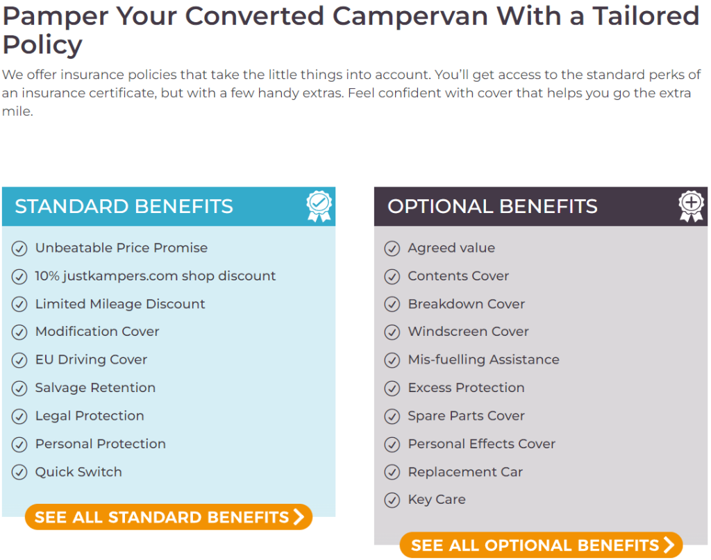
Our client, Just Kampers Insurance (JKI) have dedicated landing pages to explain the various insurance services that they provide, what they cover and the benefits of choosing JKI, which performs really well, particularly in their paid ad campaigns. By including a page dedicated to explaining the benefits of their conversion insurance, users can see exactly why they should choose Just Kampers as an insurance provider.
The landing page is also effective at converting users to get a quote by using a consistent CTA button throughout the page. Overall, Just Kampers Insurance do a fantastic job when it comes to ensuring that all of their pages have the best chance at converting users into loyal customers.
To understand how often you need to optimise your landing pages, we need to consider a few things. Do you want to improve your conversion rate? Do you want to increase how many people click on your landing pages? Has there been a change in what your audience wants to see online?
If you answer yes to any of those questions, it’s probably worth optimising your content.
Optimising landing pages can significantly impact SEO rankings and paid advertising performance. Not only does it provide users with content that they want to see, but it also ticks the boxes to give the page the best chance at ranking in organic search results.
For example, by using relevant keywords throughout the page, search engines are able to identify the relevance of your page. If users are searching for the keywords that your page is optimised for, you can increase the chances of your content ranking higher in the search results.
Your landing page will also rank better if they’re optimised for elements like site speed. For example, if your site loads slower than a competitor for the same page, search engines are more likely to prioritise your competitors page over your page. However, it’s worth noting that even if your site is very fast, but the content is terrible, it likely won’t rank. To give your landing page the best chance of ranking, it’s important to optimise as many elements of your landing page as possible.
Google Analytics and Google Search Console (GSC) stand out as some of the best tools to monitor how well your site is performing for various elements. Google Analytics gives you insights like conversions, page views and visitor demographics, while GSC shows you exactly how Google sees and displays your page in the search results, as well as which search terms your page is receiving clicks and impressions for and which sites are linking to your page. You can use this information to see how well your landing page is performing in the SERPs and optimise accordingly.
We also have access to various A/B testing tools, like Mida, to ensure that we can identify what works well on your pages based on data. Google Optimize is another free option to A/B test variations of your page. We will then use these insights to make data-driven changes and suggestions to improve the chances of your landing pages performing better. By integrating with Google Analytics, Google Opimize makes it easy to see how changes have impacted site performance.
